Baseline palette
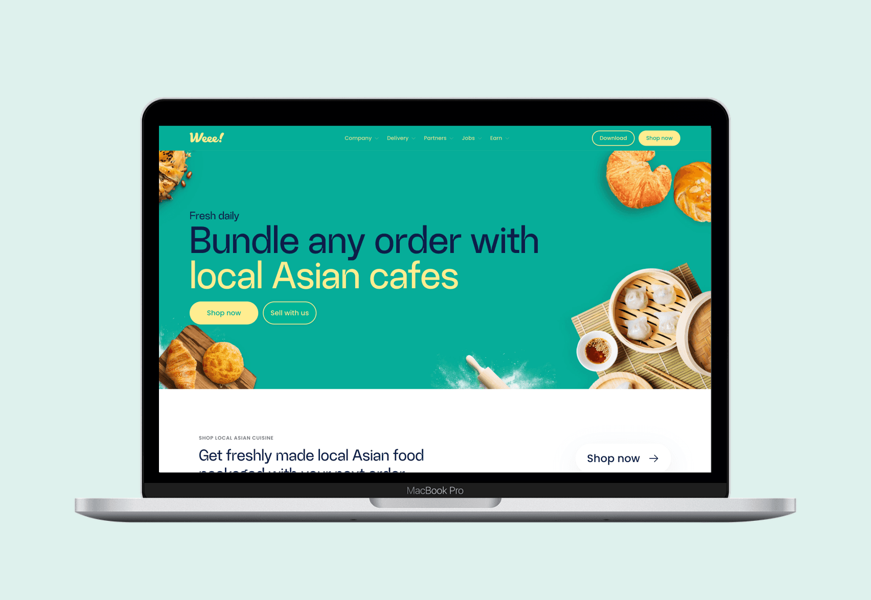
Primary palette
Our primary palette features Atmosphere Blue for calm and reliability. Flow Teal adds a lively touch to primary actions, while Ice Blue and Salt White create clean, soothing backgrounds. Pepper Black ensures text clarity with strong contrast.
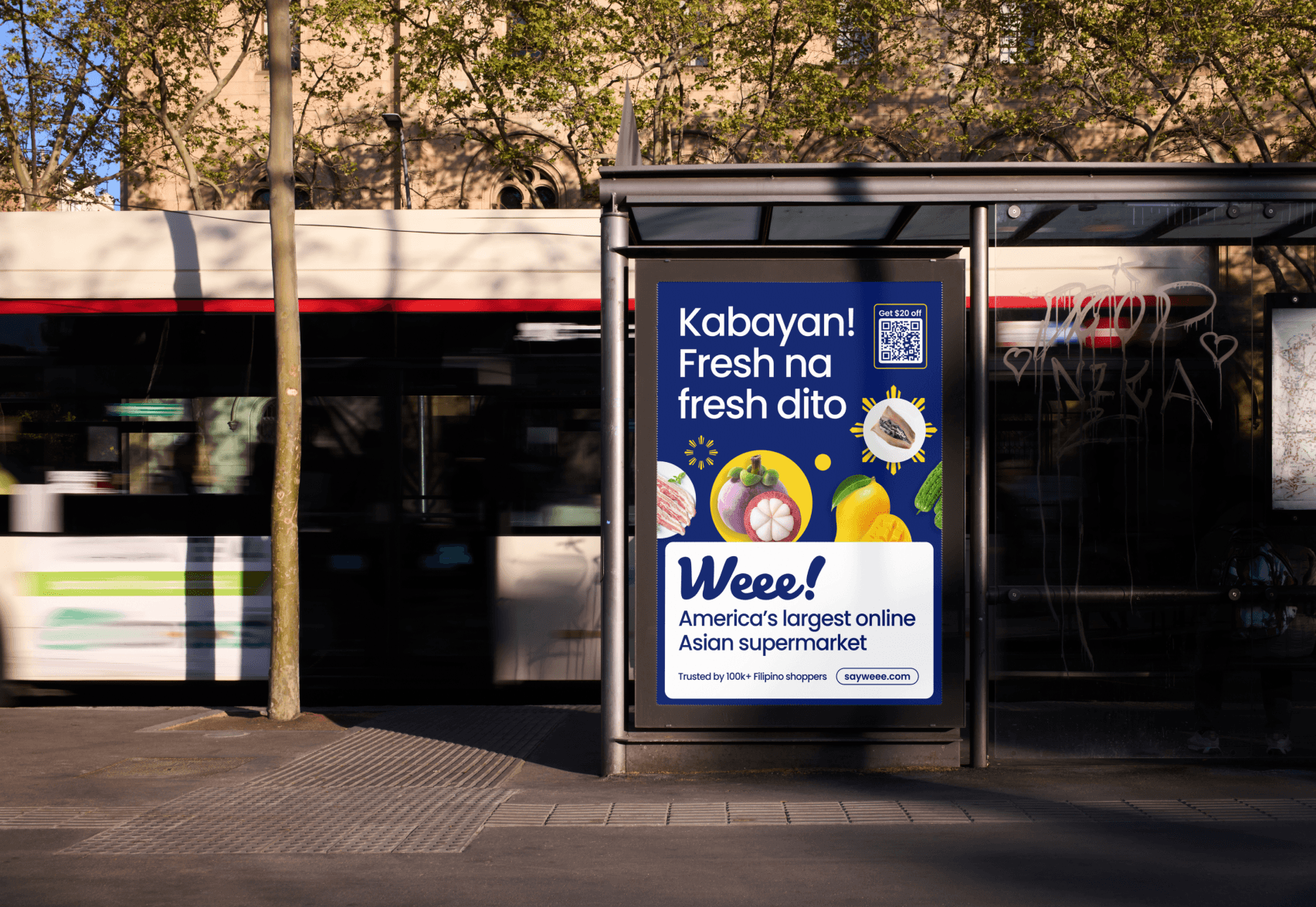
Secondary palette
Our secondary and tertiary colors add dynamic flair to our palette. Inspired by vibrant fruits and vegetables from Asia, they come in light and dark shades, infusing our brand with lively energy and ensuring our visual identity remains bold and captivating.
Tertiary palette
Cool shades
Neutral shades
Extended palette
Our extended palette is the foundation of our color system, providing a diverse array of shades to complement our baseline palette. Each shade comes in dark, base, and light variations, with seven keys in each range. This extensive selection ensures we have the perfect, vibrant colors to meet any design need, enhancing our flexibility and creativity while maintaining a cohesive look.
Jade green extended
Chive green extended
Flow teal extended
Energy blue extended
Eggplant purple extended
Dragonfruit pink extended
Tomato red extended
Mandarin orange extended
Durian yellow extended